11 Ways To Use Landing Pages In Your Business
)
What are Landing Pages & When would I use them?
A landing page is a website page that is created to turn visitors into clients. Prospective clients "land" on this page, which is designed for one purpose - to get visitors to take action!
Landing pages are designed to convey your business's message quickly and clearly while encouraging your visitor to take the action you are asking of them.
Often landing pages are constructed to aid a specific marketing campaign as they are an ideal tool to take people through a focused sales funnel, following on from the marketing campaign. It also gives you the advantage to specifically measure the effectiveness of the campaigns.
What makes a landing page successful?
A well constructed landing page should never be so focused around your call to action that you dismiss what drove your clients here in the first place. If you consider both your page's design and content you can create a successful tool that will ensure click throughs, sign ups and increased member interactions.
Your landing page can run within your website. Get your web developer to build you a landing page template (often without your website navigation, to keep people on track to the objective/ taking action).
How do I do that?
Let's look at the design first...
Tip # 1: Consider Mobile
It's very tempting to create your landing page with an amazing image background and large decisive text, however, how will this appear on a mobile device? Ensure that both your desktop and mobile versions look great especially if you are driving traffic from social media platforms.
Tip # 2: Consistency In Themes
If this is the very first place your prospective client lands, it's important that your landing page reflects your business. Consistent colours, styles, fonts and tone of voice will all help to enforce your businesses style and reinforce to your client they are in the right place.
Tip # 3: Know your market
This seems like an obvious suggestion, however knowing who your client base is, why they are here and what they are hoping to achieve from taking action is critical in designing a page that works. The phrasing behind your call to action could make or break your conversion rate. Consider who your client is and address them directly.
Tip # 4: Your Call To Action
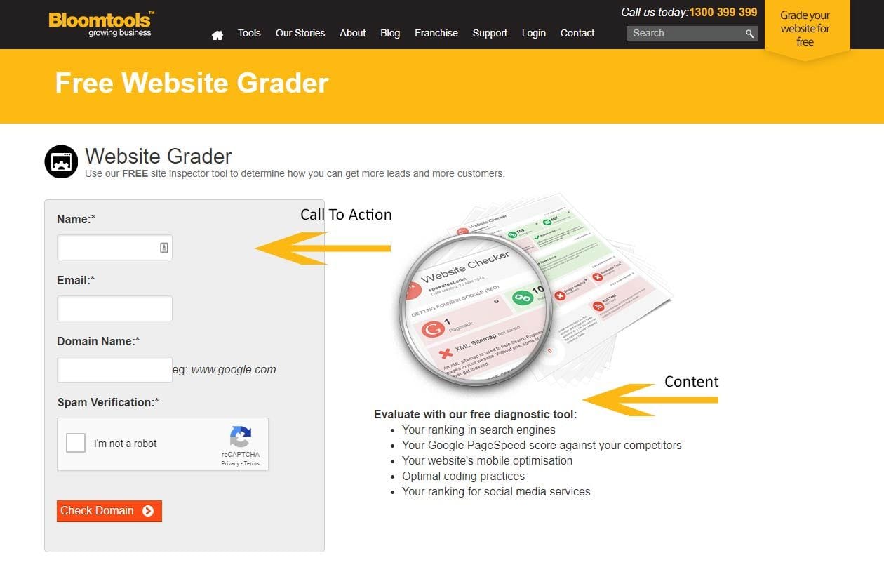
Your visitors have arrived on your landing page, now you need to tell them exactly what you would like them to do. Ensure your Call To Action is clear, concise and your content explains clearly the benefits of taking that action.
Tip # 5: Keep it above the fold
Ensuring that the appropriate information is visible at the top of your page and doesn't require a scroll is paramount to ensuring success with landing pages. Information further down the page isn't a complete no-no, however, you should place your heading, at least one call to action, explanations and benefits at the top of the page.
Tip # 6: Don't ignore design
Today's web visitors have unprecedented exposure to good, great and excellent design. The design is one of the best tools you have to increase consumer confidence. Remember you are asking a client to supply information or take action in return for a benefit and they are unlikely to do that unless they are confident that your website is both reputable and responsible. If layout and design aren't in your skill set, consider having a landing page professionally designed. You can reuse this same page over and over by changing backgrounds and base layout for future campaigns.
Now you've designed your page, your content is the next step
Tip # 7: Meta Descriptions, Keywords & Titles
Make sure you make use of all the SEO variables available to you. Use your meta description to enforce your landing pages purpose. While it is correct that Google no longer uses keywords, Google isn't the only search engine out there. For the seconds it will take, ensure you don't ignore adding keywords to your page's SEO. Title your page appropriately using a layout that is important to search engines. IE: primary keyword or phrase | secondary keyword or phrase | business name - which could translate to: 11 Tips for Better Landing Pages | Get your clients to take action | ABC SEO Education
Tip # 8: Compelling Headings
Google has reported that it takes only 50 milliseconds for visitors to form an opinion about your website. That's 0.05 seconds, which effectively means that you have a minuscule moment in time to convince your visitors to stay. While good layout and design has them feeling great, you have one chance to convince them that the page they are on is not only what they are looking for but is also beneficial to them. A powerful heading will reinforce your pages suitability and encourage them to make a further commitment. If they are coming from a marketing campaign, make sure the headline ties into the same campaign.
Tip # 9: Content-Length
The phrase "content is king" has been responsible for us all becoming more committed to providing well formatted relevant content for our website visitors. Unfortunately, we sometimes get a little too excited and forget where and when extensive content is appropriate. Landing pages need to have concise, easy to read content that conveys your message in a single read. One to two paragraphs is ideal. Placement is also of vital importance. If your background is edgy and exciting but in spanning the full page width it pushes your sign up box below the fold, that's a less than ideal outcome. Side by side content and call to action is by far the better layout. Use subheadings to help guide the reader as well.

Tip # 10: Use All The Real Estate
It is easy to get focused on everything we've suggested here and forget that some clients will always want more info. By including testimonials, more information and even an enquiry form further down the page you can build trust with those visitors who would never make a hasty decision. Don't be scared to include more info on the page, just ensure the placement is correct.
Tip # 11: Ensure it all Functions
This seems to be crystal clear, however, it is easy to get caught up in your very cool landing page and forget to set up your email trigger to send the e-Book to your client. Make sure that as part of your landing page checklist you include checking that you have set up the actions that will take place behind the scenes.
) Author:Tracey Voyce
Author:Tracey Voyce| Tags:Website DesignInternet Marketing |
Check Out Our
Recent Articles
- The 2026 Visibility Playbook: How to be Findable, Believable, and Easy t...
- Get Rewarded: How to Double Your Reach by Nailing Social Media Interacti...
- Google’s December 2025 Core Update: What It Means for Your Business
- Your Brand Doesn’t Start With Your Logo - It Starts Inside Your Business
- 2025: The Year AI Search Decides Which Businesses Get Found (and Which D...


