Mobile Commerce: 2014 proves it cannot be ignored

As we wave goodbye to 2014 we get to take a look at a whole new bunch of statistics on what society got up to this year. Not surprisingly, the use and importance of mobile phones has grown dramatically, with smartphone penetration reaching 72% of mobile market penetration.
Mobile commerce is at the forefront of the business-consumer relationship; the device for shopping, looking at reviews, checking a price and learning more about businesses, products and services - almost everything and anything.
Statistics galore, in 2014:
- More than 4 in 5 smartphone and tablet owners are using a mobile device for shopping activities
- Twenty-six percent of smartphone users plus thirty-five percent of tablet users do more shopping because of mobile devices
- 47% of smartphone owners visit social networks every day
- Search Engine Land asked, "Where are you located when you use a smartphone to access shopping-related information?," 84% of consumers said at Home, 51% in Store, and 36% said getting somewhere (hopefully while not driving a car)
- 8:00pm is the peak time for smartphone use
- 66 percent of emails were opened on either a smartphone or tablet
- Google search is the fourth ranked smartphone app in top smartphone uses, after Facebook, Youtube and Google Play.... could they be searching for your products or services?
Mobile Optimisation
Mobile compatibility has been be the biggest priority for businesses in 2014, with website redesign to optimise for mobiles being one of the biggest investments.
A study of 53 retail websites by Internet Retailer found that the conversion rate for smartphone shoppers on mobile-optimized sites is 160% higher than the rate for smartphone shoppers on non-optimized sites.
Mobile can no longer be ignored, it is the most important device to connect with your consumers through. Provide them what they want, where they want it - your products and services at the touch of a finger.
The Bloomtools Difference
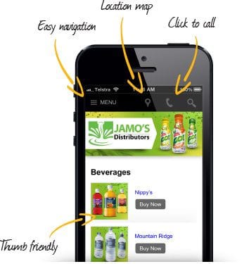
At Bloomtools we believe mobile compatibility is not an add on, but a requirement to give our clients the competitive edge. Bloomtools mobile websites are displayed differently when a mobile user accesses your website. All the tools on your website are displayed with different layouts with a focus on bigger buttons, fonts and thumb friendly actions with clear navigation, you can even have a different menu to your main site, and it includes a search feature.
Contact your local Bloomtools consultant now to enhance your businesses online presence, parallel to the needs of your constantly connected consumers. NB/ You can have a Bloomtools mobile website, without a Bloomtools desktop website.
Sources:
Nielsen Reports Digital Report
) Author:Tracey Voyce
Author:Tracey Voyce| Tags:News |
Check Out Our
Recent Articles
- 2025 Top Australian Business Directories to Boost Your Visibility
- The Power of Online Reviews: What the Latest Data Means for Your Business
- Why Blog Length Matters: Striking the Perfect Balance for Your Content
- Top Marketing Strategies for 2025
- Winning Strategies to Get More Reviews on Google, Facebook, and Beyond


