How to nail your mobile website design with these 6 design tips
)
Did you know that in the last year, there have been more mobile Google searches than ever before? Or that Google now boosts the search rankings of mobile friendly websites? These are important insights as to where the world is going in terms of how users interact with businesses online.
Having a great desktop website is just not going to cut it anymore. To stay competitive in today's market, businesses are going to need both a great desktop website and a great mobile website. So how can we make that happen? Well I've compiled a list of the best design tips to ensure your mobile website has ultimate usability and stands out from your competitors.
1) Search front and centre
This example is from an industry association. LNA website visitors rely on finding the information they are after fast, whether it is to find a landscaper, or as a member to go to their area and more. This mobile design caters to this by enabling the user find exactly what they are looking for - and fast.

2) Product photos should be large and in charge
Zacaluzoo is an Australian retailer that specializes in clothing and accessories for women and children. The mobile website displays products for their users quite large, nixing the need for zooming. Having clear and large product photos is especially important on mobile websites as users want the process to be quick and easy.

3) Include call-to-action buttons that yell "Look at me!"
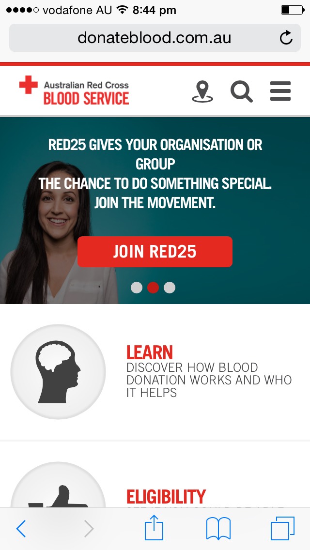
The Australian Red Cross Blood Donation's mobile website has kept their design very similar to their desktop version. What's great about the mobile website is that it is very easy for users to click the large call-to-action buttons. Call-to-action's are essential leads for your business, and of course we all want those! You can easily join their groups, learn more about blood donation or find a clinic near you. We want to make it super easy for your users to click them - so make them large and attractive.
4) Less is more
Rodd & Gunn is an international men's wear and accessory retailer. They have narrowed down what brings their customers to their website most often and they have made a navigation menu the focal point. This allows users to quickly choose what they are looking for, while still giving them the option to use the main menu and search function at the top. The design is simple, yet extremely effective as the user is able to navigate through the website seamlessly.

6) Large buttons for chubby fingers
This example from Australia's iconic brand, Akubra demonstrates two ways for a site visitor to find what they are looking for. It is designed for tapping with a single finger, making sure the user isn't't struggling to choose the right option. Don't you just hate it when you choose the wrong thing like 6 times in a row because the menu items are too close together? Yeah, me too.

A great mobile website design is what will set you apart from your competitors. Not only will users enjoy their experience more, but your SEO ranking will also improve by bringing more people to your mobile site. It's all about improving the user's experience, making it as easy and staying in their memory. If they've had a good experience with your mobile website, chances are they will come back!
Get in touch with us today about how to improve your mobile website design.
) Author:Tracey Voyce
Author:Tracey Voyce| Tags:Website DesignInternet MarketingLead Generation |
Check Out Our
Recent Articles
- Is the Mobile View of Your Website Costing You Business? 11 Things to Fi...
- Google's AI Mode is Here for Search Results: What Small Businesses Need t...
- 2025 Top Australian Business Directories to Boost Your Visibility
- The Power of Online Reviews: What the Latest Data Means for Your Business
- Why Blog Length Matters: Striking the Perfect Balance for Your Content


